Site typography, how to design content text
Site typography, how to design content text
Site typography is the ability to work with text: from typing to layout. Therefore, knowledge of these basics will be useful to everyone who somehow interacts with content. Why is this important? Violation of formatting rules complicates the perception of information, which negatively affects the efficiency of the resource. There are other reasons:
- refusal of the user to visit the site - if the pages are designed incorrectly, it can push potential customers away from the resource, where interesting and useful information can be published;
- failure to perform targeted actions - this is possible in the case when the visitor did not understand what to do. The problem may be, for example, an incorrectly selected font;
- loss of informativeness of the material - a bold attitude to the layout can lead to the fact that even a perfectly written text will remain unnoticed.
There are certain standards that simplify the process of creating text content. By following these guidelines, your site will attract leads and increase traffic.
Working with fonts.
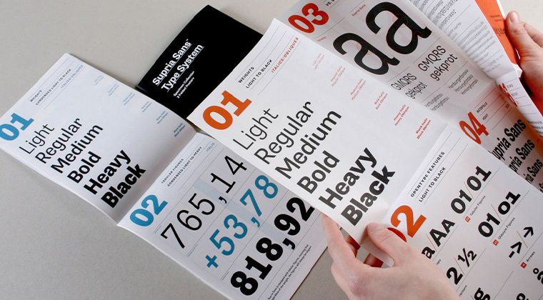
Fonts and their role are difficult to overestimate, because this is the Internet signature of your resource. Here it is important to remember one thing - it should not interfere with the perception of information. The artistic component recedes to the secondary plan, and the user becomes the leader. Another important rule is to use no more than two or three fonts in one layout. In addition, special terminology should be remembered:
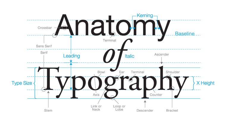
- pin - height of letters;
- kerning – intervals between letters;
- Spacing is the distance between lines.
Editors actively juggle these terms, but you still need to know them.
To use notches or not?
This dispute has been going on for a long time. Previously, the rules for text design on the website provided for the absence of indentations. This was due to the fact that old-style monitors did not display such small details well. But now there is no such problem, so the restrictions have been removed. But notches are still used only in headings, and not in the main text, so as not to annoy the user once again.
How to design headings?
Headings are created according to the pyramid principle. H1 is the most important, so it is highlighted and made the largest. H2 is the second level subheading, it should be smaller and so on down the list. The main content should be smaller compared to the last level header.
It is forbidden to use a capslock, because in this case the user perceives what is written instead of an image and does not delve into the essence. However, the use of different colors is allowed.
Do we align the texts: in the center or on the edge?
The most common option is alignment on the left edge. This is the optimal format for perception. Alignment in the center and on the right edge is also allowed, but with special care. And in terms of width - taboo, because in this case it is difficult for the reader to concentrate in order to absorb the material. Regarding headings and subheadings, they are allowed to be placed in the center of the page, and bulleted lists are structured on the left, like the main information array.
We choose quotation marks.
Captions are a sore subject for many editors and designers. You may not have known this, but there are many variations: "herringbones", "quotes", "German quotes", "single quotes", "double quotes". It so happened that we have a custom to use "herringbone trees", they are also called French feet. In some cases, double quotes are allowed when using a quote within a quote. In this situation, "trees" are combined with "feet".
Deal with dashes and hyphens.
Another problematic point. Some use only one of these symbols, although there is a difference between the two. Remember the following: a dash is a long dash that is used within a sentence, a hyphen is a short dash that is used only within a word.
What color to choose?
The classic option is black on white and vice versa. But now there are other variations that do not affect the readability of the pages. For example, a dark gray shade instead of black is considered a worthy candidate. White fonts are allowed to be used on dark shades of red, blue, and green. And there are too many complications with the acid palette, so it is better not to experiment with it.
Using a common style for the same elements.
Combining similar elements is one of the basic rules. This allows you to assemble each individual component into a single whole, which has a positive effect on visual perception.
Communication with the user is of great importance and in order to establish it, you need to use all available tools, website typography is one of them. In addition, a properly designed page along with SEO significantly simplifies the promotion process. Use the listed recommendations to develop a successful project that will become an effective sales tool.