What is a landing page and how to create it
What is a landing page and how to create it
We tell and show you what a landing page is and how to create a landing page from scratch ?
What is a landing page
A landing page is a small one-page website that encourages a customer to take one specific action: for example, to subscribe to a newsletter, buy a training course, or order a juicer.
The development of a landing page is technically simple, unlike a multi-page website. For example, you can write such a site using html/css or use ready-made templates from a website builder. It is more difficult to think over the concept and develop a high-quality landing page design to make the site effective.
Who needs landing pages and who doesn't
A landing page is not a universal website. It will be enough for some people's needs, while for others, a regular multi-page website will be more suitable.
We have collected successful and not-so-successful examples of landing page use and grouped them into a list.
When can use a landing page
- Inexpensive products in small quantities. Since the landing page is a single-page website, it will be inconvenient to place a catalogue with a large number of products on it. For a large assortment, you should create an online store.
The ideal option for a landing page is a single product or service with the ability to change its characteristics. For example, online English courses or a line of organic sugar-free sweets. - Hot offers. You know for sure that your product or service is currently in a wave of popularity, customers already know about it from other sources, and you don't need to describe it in detail. In this case, landing page is the best way to "finish off" a customer with a well-formulated offer.
- Building a customer base. If you are planning to launch an online business, you may not know the audience for your offer. To test the market and build a customer base, a landing page with contacts of interested visitors will do.
When a landing page won't work
- A well-known product or service. Your product is well known to customers, there are many competitors in your industry, and you have advantages over them. In this case, you should create a full-fledged website with a detailed description of your offer and your company.
- Company information website. If your goal is to tell about the company and you don't expect the visitor to take any action, it's better to use a blog or a large information site.
- Create a company brand. Users have less trust in a landing page, which is why it is inferior to a multi-page website. If you have a long-term goal of developing your own brand, we do not recommend starting with a landing page.
Types of landing pages
Ice generation
This type of website always has a form for collecting visitor data. The form is used to collect a database of potential customers. The visitor will not want to give his contacts for nothing, so the company can offer a free product or bonus in exchange for the visitor's data.
Product landing pages
Advertising landing pages or product landings are distinguished by the presence of a call-to-action button, or CTA. All elements of the site lead the customer to the order button.
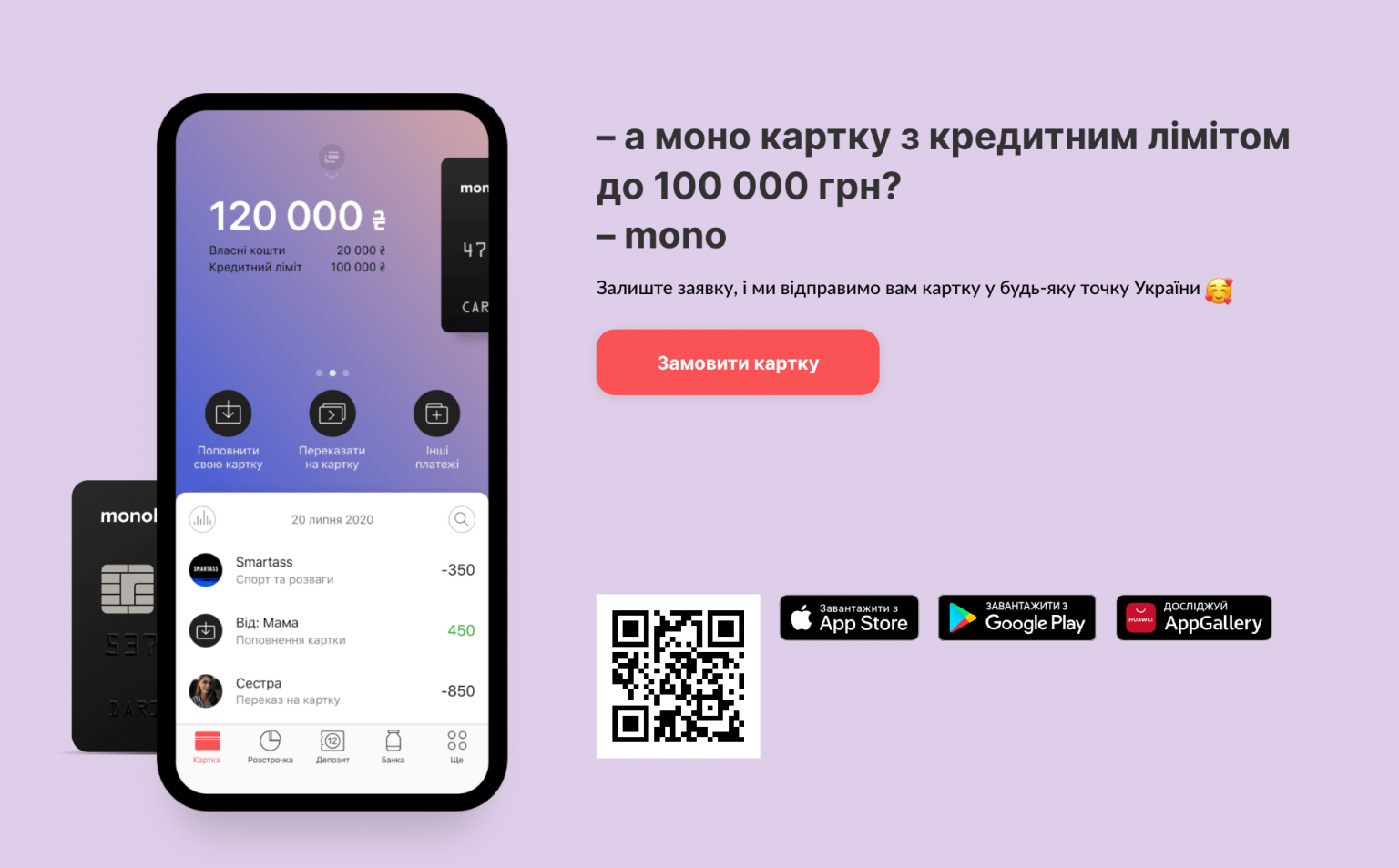
Product landing page or selling landing page is the most popular type of single-page website. Its main advantages are over multi-page online stores:
- fast to create - you can create a landing page from scratch in 1-2 days using ready-made templates in website builders;
- fast loading - landing pages are much smaller than regular websites, so the site will work quickly even from the mobile Internet;
- cheap - the minimum hosting tariff is suitable for a landing page, and you can create a one-page website yourself without hiring a developer.
- does not distract the customer's attention - a high-quality landing page leads the customer step by step to the purchase of goods without distracting them to other pages and categories.
One type of selling landing page is a quiz. This is a questionnaire website that offers a step-by-step choice between different product characteristics and, at the end, a chance to complete the transaction.
Business card or informational landing page
Such landing pages do not sell anything and only tell about the product, promotion, or company. The purpose of an informational landing page is to stir up interest in the product and drive traffic to the company's main website. To attract attention, info landing pages often use bright design and flash animation.
How to make a landing page yourself
Start creating a landing page with preparation. Describe what you are selling, who your target audience is, and how your product or service will benefit them. You can rely on this description when writing texts and searching for images for your website.
Find competitors' websites to note for yourself what you want to see on your landing page and what you should avoid. Compare the offers themselves, determine why it will be beneficial for the client to buy goods from you - free delivery, warranty service, or a low price.
You can find competitors' websites by using popular search engine queries. For example, if you sell drills, enter «buy drill» or «drill Ukraine». A quick way to find the right search queries is to use Google's free keyword planner. Write down the main words related to your product, and it will find the most popular queries for them.
Enter multiple keywords at once and use the Scheduler's suggestions
By entering these keywords in a search engine, you will find the websites of your competitors. Don't forget to check out marketplaces like OLX, Rozetka, Bigl.ua, and social networks like Facebook or Instagram.
Write the text and come up with the main blocks of the landing page. This is one of the most important stages of working on a website, because landing is not about beautiful design, landing is about an effective structure and selling text.
The structure of a landing page is most often adjusted to the AIDA marketing model:
ATTENTION — attention
INTEREST — interest
DESIRE — desire
ACTION — action
This is a sales funnel where you first need to attract the customer's attention, then make them interested in the uniqueness of your offer, make them want to get your product, and finally push them to take action - buy, order, or place an application.
Based on this formula, we have created a standard structure of a selling landing page. Use it as the «skeleton» of your website. Add your own blocks to it or remove unnecessary ones.
Headline
The header block is the first element of the landing page that the client sees. It should catch the eye and make them want to stay on the site. The headline itself should be short, concise, and clear. You can also use a subheading. It will help to shorten or explain the main headline.
About the product
Tell us more about your product or service. If it's a product, describe its characteristics and attach a video of how it works. If it is a service, explain what the client will receive. Suggest use cases, for example, indicate that the barbecues you sell are good for a picnic because they are easy to fold and weigh only 10 kilograms. Or your English courses can be taken during the summer holidays because they last three months.
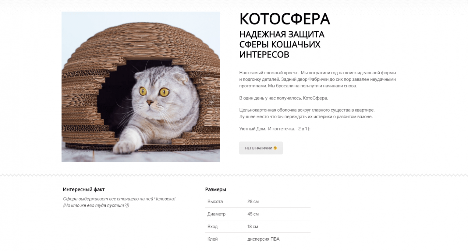
An example of an interesting product block design is the website of CotoFactory. It has a vivid picture of the product (and a cat, great move! ?), an original description of the product, and its characteristics.
Advantages and benefits
Explain to the customer why you are better than hundreds of other sellers, why the customer should buy your handmade toy or sign up for your violin lessons. Tell them that you make toys from materials that do not cause allergies and that they can be washed in a machine. Describe that you give violin lessons in the evenings and on weekends, which is convenient for schoolchildren and those who work on weekdays.
It is convenient to write the advantages in a list or in small blocks. The latter was chosen by the authors of the Duolingo website.
Who can use the product
This is where your knowledge of the product's target audience comes in handy. Tell us who will benefit from it and what problems it will solve.
Tariffs and prices
Everything is simple here - specify the price of the product or the tariff schedule for the service. Write down what is included in the price. It can be door-to-door delivery, round-the-clock support, or a private chat with a coach in a telegram.
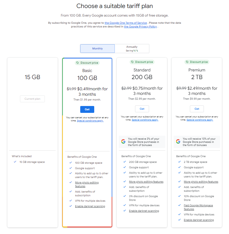
If there are several tariffs, visually highlight the most popular one. This will make it easier for the customer to choose.
What a landing page with rates from Google One looks like:
Scheme of cooperation
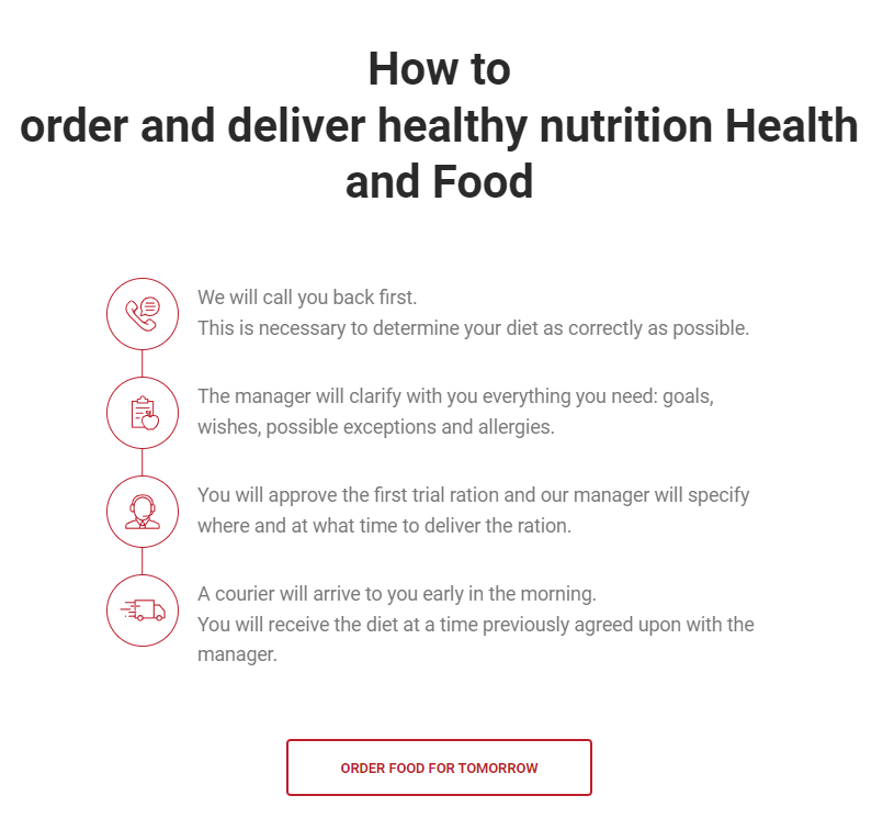
Explain to the client all the steps of cooperation, from ordering to receiving the goods or services. It's best to make it in the form of a structured list or a step-by-step diagram, like on the Health and Food website.
Order form
In this block, you can make a headline and subheading that will motivate the customer to complete the order. Just don't duplicate it with the first block of the landing page. They should continue each other in content, but not copy each other.
Encourage the client to place an order right now by making a discount on the product and indicating the period of time it will be valid. Write whether payment is made in instalments or a refund.
Reviews.
Add a testimonial section to show the client that you can be trusted. Don't write testimonials yourself or order them from copywriters, attaching images of smiling people from photo stocks. This is immediately obvious, and such fraud will drive away a potential client rather than make them want to work with you.
Add testimonials with real photos, videos, and links to your clients' social media pages (with their permission, of course). A good example of such a block can be found on the website of the Al.Cuisine culinary academy.

ChaPi
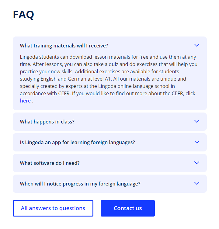
The right landing page answers the client's questions in advance. Place a block with answers to frequently asked questions on your landing page. It will help to remove the client's fears «why is it so cheap» or work with his objections «why is it so expensive».
Design the FAQ block in the form of an interview, chat, or a list of questions with drop-down answers. A simple and minimalist version of this block is available on the Lingoda website.
Contacts
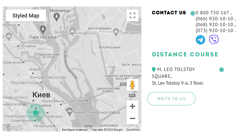
Usually, contacts are indicated as the final block of the landing page. Their presence will additionally emphasise that you are a real company, not a one-day scam.
Include your organisation's address, a map, phone numbers, and links to social media. Check out an example of such a block from the Green Forest English school.
When you're done with the text and structure of your landing page, select the appropriate images, videos, and photos. Don't use images from the Internet, try to use your own. Take high-quality commercial photos of your product or hire a professional photographer for this purpose.
Next, move on to the technical component of website development.
Choose the name of the site - the domain. A domain consists of a part that you come up with yourself and a part that you can choose from existing domain zones such as .com, .net, .kyiv.ua, etc. For example, we came up with the name «bbstudio» and chose the .site domain zone - as a result, we got the domain bbstudio.site.
Find a place to host your landing page - hosting. Look for a hosting with a website builder or a hosting with pre-installed website engines that will have ready-made landing page templates. This way you can create a selling landing page quickly and easily.
If you choose a website builder, try to create a landing page using the How to make a one-page website guide. This is a good starting option for beginners: you can make a landing page from scratch yourself in an evening.
As for the engines, pay attention to WordPress - it is the most popular CMS in the world, so there are many free tutorials on it. We also have a step-by-step guide on how to make a WordPress website, and we're honestly proud of it :)
If you're thinking about how to create a landing page for free, look for free hosting options, but be aware of their disadvantages in advance.
Conclusion.
Now you know what a landing page is and how to create a landing page yourself for free or almost free.
