We create digital solutions that work for businesses
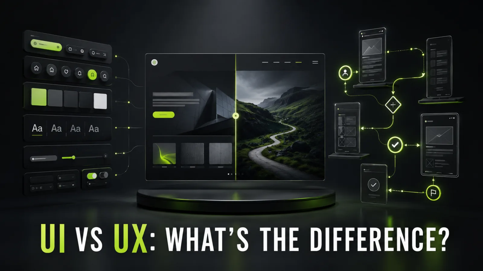
UI and UX usually appear together, so they can look like one service to a business owner. They are two different layers of product design.
UX asks: Can a person reach the intended outcome easily? UI asks: Do the elements they interact with look and behave clearly?
A beautiful button does not help if visitors do not understand why they should press it. A logical purchase flow can also fail when text is hard to read, controls are invisible, or form states are ambiguous.
The useful question is not “Should we choose UI or UX?” It is “How should we design the experience and express it through a clear interface?”
User experience is the overall experience a person has with a product, service, and company. Nielsen Norman Group defines UX broadly as all aspects of the end user’s interaction with a company, its services, and its products.
For a website, the experience begins before the first screen. A person arrives with expectations created by a search result, advertisement, referral, or previous contact. They interpret the offer, find details, compare options, complete an action, and wait for confirmation.
UX design considers:
who the user is and what they need to accomplish;
where they arrive from;
what information they need at each stage;
website architecture and navigation;
steps leading to a lead, booking, or purchase;
likely doubts, errors, and interruptions;
system feedback;
what happens after submission or payment.
UX is more than making a page “easy.” The journey should be relevant, understandable, predictable, accessible, fast, and appropriate for the user’s context.
The user interface is the layer through which someone interacts with a digital product. Figma describes UI through a screen’s look, feel, and interactivity.
UI includes:
color and contrast;
typography;
buttons, links, and fields;
icons;
spacing and grids;
cards, tables, tabs, and dialogs;
hover, focus, loading, success, and error states;
visual hierarchy;
responsive component behavior;
animation and microinteractions.
UI is not decorative polish added after the “real work.” It makes structure visible, actions recognizable, and system status clear. Users should be able to distinguish a button from body text, an active control from a disabled one, and success from failure.
| Criterion | UX | UI |
| Main question | How does the user reach the goal? | How does the interface look and behave? |
| Focus | The journey and its logic | Visual and interactive implementation |
| Starting point | Problem and audience research | Visual direction and components |
| Typical outputs | Sitemap, user flow, wireframe, prototype | UI kit, screens, states, design system |
| Validation | Interviews, usability tests, analytics, experiments | Contrast, consistency, accessibility, state review |
| Business value | Less friction and fewer journey losses | Clear controls and a coherent brand |
| Common failure | An unnecessary or confusing step | An unreadable label or invisible action |
| Relationship | Extends beyond the screen | Forms part of the overall experience |
Restaurant UX includes booking a table, finding the entrance, understanding the menu, ordering, communicating an allergy, paying, and receiving help.
UI is the presentation of the menu, signs, table number, payment-terminal controls, and bill. A beautiful menu cannot rescue a confusing structure. A logically organized menu can still fail when the type is tiny and low-contrast.
On a website, UX creates the route and UI makes it visible and operable.
Imagine a clinic website with premium photography, modern typography, and polished animation. It looks expensive, but specialties are hidden behind unfamiliar labels, pricing exists only in a PDF, the booking button opens a generic form, and the confirmation does not explain when the clinic will respond.
The interface creates a positive first impression, while the experience introduces friction. The business may receive compliments about its design and still lose bookings.
Another website has a logical structure, transparent pricing, a short form, and an efficient booking flow. However, body text has poor contrast, buttons resemble labels, fields do not show errors, spacing is inconsistent, and mobile targets are too small.
The journey is sound, but the interface makes it harder to complete and reduces perceived trust.
UI and UX are not competing alternatives. UX defines the logic; UI communicates and operates that logic. Removing either layer moves the problem somewhere else.
Starting with a visual mockup can result in an expensive presentation of the wrong structure. Stopping at a grayscale prototype forces developers to invent colors, states, components, and responsive rules, producing an inconsistent product.
A practical order is:
business goals and constraints;
user needs;
information architecture and flows;
wireframes and prototype;
visual direction;
components and states;
testing;
implementation and measurement.
The work can overlap, but visual decisions should not replace validation of the underlying journey.
Define the product, website goals, audiences, traffic sources, content, integrations, technical limits, competitors, and success metrics.
Output: an agreed problem and project scope.
Study queries, interviews, analytics, sales conversations, session recordings, CRM data, support requests, reviews, and competing products.
Output: needs, jobs, objections, and usage contexts.
Create the sitemap and decide how services, products, cases, pricing, help, and contact information are organized.
Output: page map and navigation rules.
Map the steps required to find a service, choose a product, book, pay, or resume an interrupted task.
Output: primary and alternative journey diagrams.
Use low-fidelity page structures to define content order and priority without final visual styling. Structural changes are cheaper here.
Output: layouts for major page templates.
Connect screens so stakeholders and participants can complete realistic tasks before development.
Output: a prototype for demonstration and usability testing.
Define typography, color, grid, imagery, controls, and the overall visual language.
Output: an approved direction applied to key screens.
Build reusable elements with default, hover, focus, disabled, loading, success, and error behavior.
Output: UI kit or design system.
Design priorities for narrow screens, touch targets, menus, tables, forms, and content order—not merely smaller desktop screens.
Output: key breakpoints and responsive rules.
Developers receive components, spacing, assets, behavior, and specifications. The designer reviews the implemented screens and user flows.
Output: a working interface that preserves the intended experience.
Depending on scope, the package may include:
sitemap;
user flows;
wireframes;
clickable prototype;
UI concept;
desktop and mobile layouts;
reusable components and states;
type and color systems;
patterns for forms, tables, dialogs, and messages;
content recommendations;
prepared imagery and icons;
motion specifications;
development notes;
usability-test findings.
“Homepage design” does not define a complete product. Agree on unique templates, responsive variants, component states, revisions, and handoff before work begins.
Conversion: clear offers, visible actions, and efficient forms reduce funnel loss.
Development cost: prototypes reveal structural issues before code, while reusable components reduce duplicate implementation.
Future changes: a design system lets the team assemble new pages from established rules.
Trust: consistent visuals, transparent information, predictable controls, and useful feedback reduce uncertainty.
Support cost: clear instructions and actionable error messages reduce repetitive questions.
Analytics quality: defined flows and goals make event naming and funnel measurement easier.
UX should account for people using keyboards, zoom, assistive technologies, or different modes of perception. UI should provide visible focus, sufficient contrast, recognizable states, and adequate pointer targets.
WCAG specifies a 4.5:1 minimum contrast ratio for normal text and 3:1 for large text. Visual information required to identify controls and states is covered by non-text contrast requirements. WCAG 2.2 defines a 24 by 24 CSS-pixel minimum pointer target with documented exceptions.
These thresholds are a baseline, not a substitute for testing. Accessibility also depends on semantic HTML, keyboard operation, form labels, language, and implementation.
Are the main audiences and tasks defined?
Does every important page have a clear purpose?
Does navigation reflect customer language rather than internal departments?
Is the next step obvious?
Are empty, error, loading, and success states included?
Do forms request only necessary information?
Can users go back without losing work?
Has the prototype been tested with realistic tasks?
Are analytics events planned?
Is the mobile journey efficient?
Is the visual hierarchy clear?
Is text easy to read?
Are buttons and links recognizable?
Is color never the only signal?
Are hover, focus, pressed, disabled, loading, error, and success states defined?
Are components consistent across pages?
Do layouts handle real content and long labels?
Are mobile screens included?
Do animations respect speed and accessibility?
Are assets ready for development?
The hero does not explain the offer.
Navigation mirrors the organization rather than customer tasks.
Every block has the same visual weight.
The primary CTA changes label and appearance between pages.
Errors do not explain how to recover.
Important information is hidden in tabs without a reason.
Mobile is a mechanically compressed desktop layout.
Contrast and typography reduce readability.
Actions provide no feedback.
A simple task requires account creation.
Layouts use ideal placeholder copy instead of real content.
Missing states force developers to invent behavior.
UI-focused work can be appropriate when the structure and flows are already validated, a design system exists, and the task is to add screens or update the visual layer without changing product logic.
A fuller UX process is needed when the team is creating a new product, changing the business model, seeing journey abandonment, serving several audiences, adding checkout or booking, or using redesign to solve a business problem rather than refresh the appearance.
A UX researcher studies user behavior and needs. A UX designer creates architecture, flows, and prototypes. A UI designer builds the visual and component system. A UX writer designs interface language. A product designer may combine several responsibilities. Developers implement the behavior, analysts measure it, and marketers connect the offer and traffic.
Job titles can vary. The process, skills, ownership, and agreed deliverables matter more.
Do not evaluate the work only with “I like it” or “It looks modern.” Match metrics to the original problem:
task success rate;
time to completion;
errors and backtracking;
form completion;
lead or purchase conversion;
qualified-lead rate;
revenue per user;
support contacts;
usability-test findings;
device and traffic-source behavior.
Not every change can be credited to design without a controlled comparison. Use an A/B test or staged rollout for important changes when traffic and risk justify it.
Choosing by personal taste: the owner is not the entire audience. Brand judgment matters, but product logic should be evaluated through user tasks.
Starting with the homepage: a homepage does not define all templates and journeys. Build the architecture first.
Copying a competitor: their interface may serve a different audience and hide unknown problems. Use it as a hypothesis, not proof.
Delaying mobile: mobile changes priorities, controls, navigation, forms, and content order. It is part of design, not a final conversion task.
Approving placeholder content: real titles, prices, product details, and errors expose layout problems.
Skipping design QA: even a detailed mockup can be implemented incorrectly. Review screens, states, breakpoints, and journeys after development.
UX designs the path to an outcome. UI makes the path visible, understandable, and consistent. A strong website needs both. Without UX, a team can beautifully present the wrong journey. Without UI, it can make a sound journey difficult to operate.
The business outcome is not merely a Figma file. It is a website where people understand the offer, find the right information, complete tasks with minimal friction, and where the team can develop new pages using shared rules.
BB STUDIO can design the information architecture and flows, create the UI system and responsive layouts, implement the website, and validate the result after launch.
 Design & UI/UX
 Design & UI/UX
 Artificial Intelligence
 SEO
SEO
 Let’s create something amazing together
