We create digital solutions that work for businesses
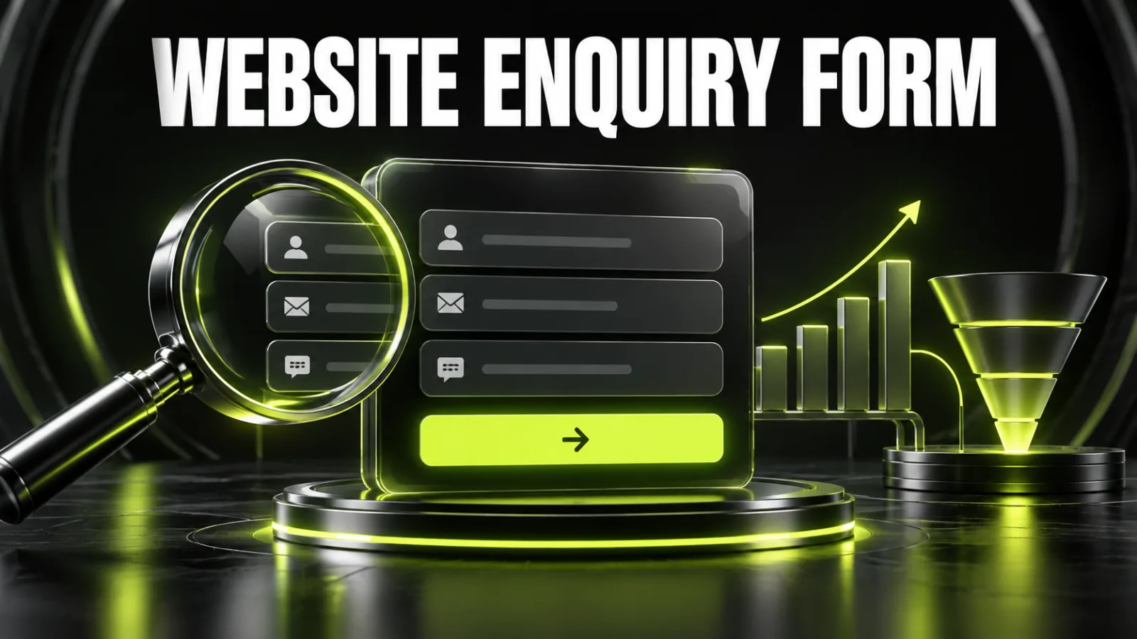
An enquiry form is the point where a visitor’s interest should become an action. They may already understand the offer, review proof and accept the likely price. Yet one unnecessary field, an inflexible phone mask, an intrusive CAPTCHA or missing success message can end the journey.
The best form is not automatically the shortest. It asks for the minimum information required for the promised next step, explains unfamiliar requests, works comfortably on a phone and makes errors easy to recover from. If the obstacle extends beyond the form, begin with a broader website UX audit.
For an initial service enquiry, three elements are often enough: a name, one contact method and a short description. Add budget, deadline, company or service selectors only if they genuinely change lead routing or remove a necessary follow-up step.
A reliable form has:
When the form is part of a new product or redesign, define the journey during website design and redesign rather than patching it after launch.
Before entering anything, users should understand what happens next. “Submit” describes a technical action, not a benefit. “Get an estimate”, “Book a consultation”, “Check availability” or “Request a proposal” set a clearer expectation.
Match the promise to the required data:
| Promise | Data usually needed initially |
|---|---|
| Call me back | name, phone, preferred time |
| Send an estimate | contact, project type, brief description |
| Book a consultation | name, contact, date or time slot |
| Prepare a B2B proposal | name, business contact, company, need |
| Price a complex project | contact and short brief; collect detail in a second step |
If a callback form demands a full address, job title, company website and marketing budget, the request feels disproportionate. Trust falls before a salesperson ever speaks to the prospect.
There is no universal number. Judge each field with two questions:
Sort fields into three groups:
Use the first group and, where valuable, one simple control from the second. Capture UTM parameters, landing page, campaign, referrer and device in hidden fields instead of asking visitors to identify them.
A longer form can be reasonable when the value is obvious. A ten-step calculator that immediately produces a tailored estimate may feel worthwhile. The same workload behind a generic “Send” button feels excessive.
One screen suits a short contact request. A multi-step flow is useful when questions form meaningful groups, such as project type, specifications and contact details. It reduces visual density but does not remove the work.
For a multi-step form:
On a campaign page, the form must continue the same offer and language. That is why landing page development should treat the first screen, proof, CTA and form as one journey.
A placeholder disappears as soon as typing begins, so it must not be the only label. Keep “Work email” visible and, if useful, show name@company.com as an example inside the control.
Do not rely on an unexplained asterisk. Identify required and optional inputs in words. If nearly everything is required, marking the few optional controls is usually easier to scan.
Put instructions before or beside the field rather than revealing them only after failure. Explain why a budget helps: “This helps us recommend a realistic delivery option.” State allowed file types and maximum size before someone chooses a file.
A mobile form is not a scaled-down desktop component. Complete it with one thumb on real devices, with the keyboard open and on a weaker connection. The wider interface checklist is covered in responsive web design and mobile UX rules.
Check that the form provides:
type="tel" for phone numbers and type="email" for email;autocomplete tokens for name, phone, email, organisation and address;Do not reject spaces, parentheses or a leading plus unless necessary. The server can normalise the stored number while letting people type naturally.
An error message should show where the problem is, what happened and how to fix it. “Invalid value” fails that test. “Enter a phone number with a country code, for example +44 7700 900123” provides a route forward.
Good validation:
For multiple errors, provide a short summary above the form with links to affected controls. Never clear correct answers because one value failed.
Use a button label that completes the promise: “Get my estimate”, “Book consultation” or “Send project brief”. After activation:
A useful message is specific: “Thank you, we received your request. A project manager will call within 30 minutes during business hours. We sent a copy to your email.” It confirms success and sets expectations.
Explain who receives the information and why. Do not bundle an optional marketing subscription into mandatory consent required to answer an enquiry. Where a newsletter exists, its choice should be separate and understandable.
Trust signals near the form include:
Avoid requesting identity, payment or other sensitive details in an initial lead form unless they are essential to a regulated process.
A visible CAPTCHA can block legitimate users, especially on mobile or with assistive technology. Begin with quieter controls: a honeypot field, rate limits, server-side timing checks, pattern detection and risk scoring. Add a visible challenge only when traffic appears suspicious.
Monitor false positives. Log the reason for rejection, test the process on common browsers and devices, and retain a fallback contact route. Spam protection is part of the funnel and should be measured like any other step.
Perfect interface design is wasted if the email disappears or no owner receives the lead. A dependable route looks like this:
form → server validation → database or queue → CRM → owner → user confirmation → delivery log.
Email alone is a fragile single point of failure. A CRM and website integration can include the page, UTM values, form ID, consent, timestamp and a technical identifier. If the CRM is unavailable, queue the lead and retry rather than discarding it.
A single form_submit event cannot reveal where people stop. Track at least:
Use the separate guide to set up Google Analytics 4 events and conversions before interpreting the funnel.
Use three core rates:
Start rate = form starts / form views
Completion rate = successful submissions / form starts
Qualified lead rate = qualified leads / successful submissions
More submissions are not automatically better when most are irrelevant. During website development, connect browser events with the server and CRM so the business can measure the full path.
Change one meaningful variable per hypothesis. Do not replace the headline, fields, CTA, offer and placement in one experiment. A useful hypothesis is: “Making budget optional will increase completion without lowering the qualified-lead rate.”
Potential experiments include:
Judge completion, lead quality, cost per qualified lead and sales. A version that creates more low-quality enquiries may cost the business more.
An enquiry form should reduce uncertainty, not turn a first conversation into an administrative questionnaire. Start with a clear promise, request the least data needed for the next step, make mistakes recoverable and confirm the outcome. Then measure both completion and lead quality.
If you need a form redesigned with its landing page, analytics and lead routing, discuss the project with BB STUDIO. For the wider conversion context, see UI/UX design that converts.
 Design & UI/UX
 Analytics and Conversion
 Design & UI/UX
 Google Ads
 Let’s create something amazing together
