We create digital solutions that work for businesses
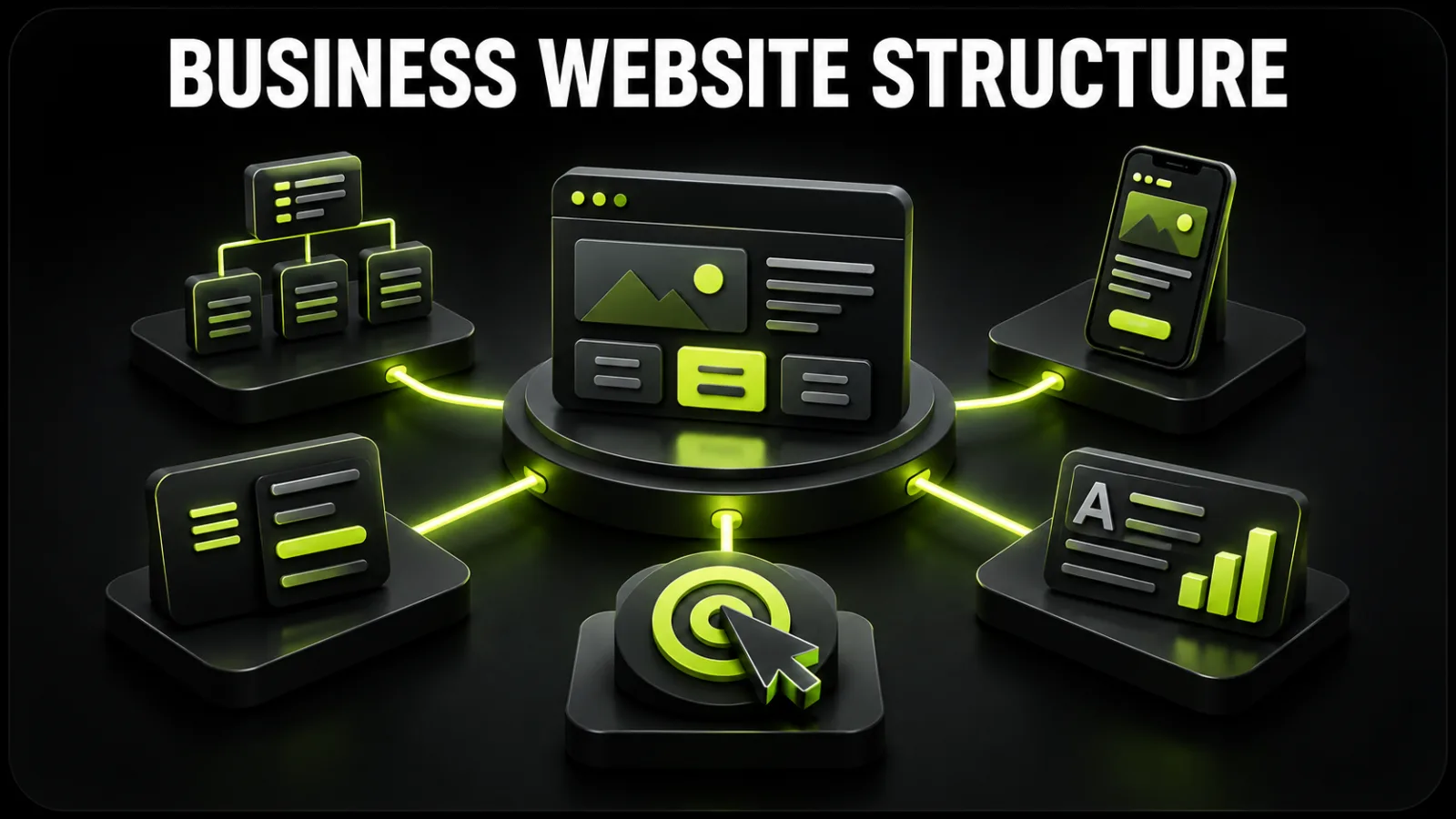
Website structure is more than a navigation menu. It determines which pages exist, how they connect, how a visitor moves from discovery to enquiry and which URLs can satisfy distinct search intents.
A good structure helps three audiences:
visitors find the right service, price, proof or contact quickly;
the business guides different audiences toward the appropriate action;
search engines understand page topics and relationships.
Planning mistakes become expensive once design and development begin. If services, case studies and SEO content are added after layouts are approved, the team may need to rebuild navigation, templates and URLs. A sitemap should therefore precede visual design. This is the foundation of systematic business website development.
This is the URL hierarchy: homepage, services, case studies, blog, contact and legal pages. It can be represented as a tree or table.
This is the sequence of sections within a page: hero, benefits, process, examples, testimonials, FAQ and form.
A site may have tidy navigation but a weak service page, or a persuasive homepage with a chaotic URL system. Both levels must work together.
Do not copy a competitor’s sitemap before defining the job. Answer five questions:
Which services or products are priorities?
Who buys each one?
What questions and objections does each audience have?
What is the primary conversion: form, call, booking, purchase or quote request?
Which searches should lead to each offer?
A construction company may provide private homes, commercial construction and apartment renovation. These services have different customers, evidence, budgets and timelines. One generic Services page cannot answer all three intents well.
The broader planning process is covered in how to create a business website from scratch.
| Page | Purpose | Core content | Primary action |
|---|---|---|---|
| Homepage | explain positioning and guide visitors | offer, services, proof, cases, process | choose a service or enquire |
| Services index | show all directions | short summaries and links | select a service |
| Individual service | satisfy one commercial intent | outcome, scope, process, pricing, proof, FAQ | request a quote |
| Case studies | demonstrate experience | challenge, solution, result, visuals | discuss a similar project |
| About | build trust | team, approach, facts, expertise | view work or contact |
| Pricing | provide a financial frame | packages, pricing factors, extras | request an exact estimate |
| Blog | capture informational demand | guides, comparisons, answers | continue to a service |
| FAQ | resolve repeated objections | specific questions and answers | ask another question |
| Contact | remove friction | phone, form, address, hours | get in touch |
| Legal | explain data and site rules | privacy, cookies, terms | provide transparency |
This is a starting point rather than a rigid template. Sections can be combined on a small initial site, but priority services should not be buried on one long page.
A dedicated service page can:
match one search intent precisely;
use a relevant SEO title, H1 and description;
show the right case studies and testimonials;
explain a distinct process and price;
receive highly relevant advertising traffic;
measure conversion by service;
present a specific call to action.
Create a separate page when a service has its own demand, audience, workflow or value proposition. Avoid producing dozens of near-duplicate pages that only swap a city name; that adds little value and creates duplication.
The homepage is not a storage area for every fact about the company. Its job is to explain who you are, what you offer, who it is for and where the visitor should go next.
Include:
a specific H1 describing the result or specialization;
a concise explanation;
one primary button;
a secondary path for visitors who are not ready;
a visual that supports the message.
“Building the future together” sounds polished but says little. “We develop business websites ready for SEO and advertising” gives the visitor useful context immediately.
Show three to six important directions with a short benefit and a link to each full page. Avoid turning cards into long articles.
Replace generic claims such as “quality” with verifiable facts: completed projects, years of experience, specialization, technology, response time or a transparent delivery model.
Do more than show attractive screenshots. Explain the challenge, constraints, solution and measurable result. If figures are confidential, describe what changed.
Visitors want to know what happens after an enquiry. Four to six stages are usually enough: discovery, research, prototype, design, development, launch and support.
Provide the person’s name, company, project context and a link to an independent source where possible. Anonymous praise without context creates little trust.
Use genuine sales questions about timelines, payment, content, domain ownership, access, support and future changes.
Restate the value and offer one simple next step. Five equal buttons create hesitation instead of choice.
A service page should answer a specific commercial query more completely than the homepage.
Recommended order:
H1 and outcome. What the client receives.
Who it is for. Suitable businesses or situations.
Problem. What happens without the solution.
Scope. Tangible deliverables rather than vague activity.
Process. Stages and client involvement.
Examples. Relevant case studies.
Pricing. A figure or transparent calculation method.
Timeline. A range and the factors that affect it.
FAQ. Objections before the enquiry.
Form. Few fields and a clear next step.
Button labels should set expectations. “Request a quote”, “Discuss the project” or “Book a consultation” is clearer than “Learn more”.
Avoid a generic story about a young passionate team. Show who is accountable, how the company works, what expertise it has and which facts support its claims.
Use a repeatable structure: client context, challenge, starting point, solution, your role and outcome. Case studies can be more persuasive than a benefit grid in complex B2B sales.
When a fixed figure is impossible, publish a starting price, typical packages or calculation factors. No price context at all causes some qualified prospects to leave.
A business blog should target real customer questions rather than company news alone. Each article should lead naturally to a service, case study or consultation. Related planning resources are collected in the Web Development category.
Include contact methods, hours, legal identity, address when relevant, a map for physical locations and a short form. After submission, tell the user when and how the team will respond.
Privacy, terms and cookie information depend on the site’s forms, analytics, advertising and target markets. Do not copy a competitor’s documents without adaptation.
A service-business menu often needs no more than:
Services — Case Studies — About — Blog — Pricing — Contact
Do not place every secondary page in the main navigation. Use a clear submenu for a larger service list and keep legal documents in the footer.
Practical rules:
use labels customers understand;
make the logo return to the homepage;
highlight the current section;
keep important pages discoverable without site search;
add breadcrumbs for larger hierarchies;
repeat key routes and contact details in the footer;
make the 404 page offer useful destinations.
The “three-click rule” is not absolute. A logical, predictable route without dead ends matters more than an arbitrary click count.
Build structure alongside keyword and intent research. One main intent should have one primary page. When two URLs answer the same question with very similar content, they may compete with each other.
Good URLs are short, descriptive, consistent, stable and free of arbitrary IDs. Internal links should exist inside relevant content as well as navigation: article to service, service to case study, and case study to consultation. Descriptive anchor text is more useful than “click here”.
Record URL maps, page functions and integrations in a website technical specification so the client, designer and developer share one scope.
Mobile is not a smaller desktop. Priorities change on a narrow screen:
keep the offer and primary action clear;
make navigation short and predictable;
use tappable phone and messenger links;
rebuild wide tables when necessary;
remove unnecessary form fields;
do not hide essential content;
prevent sticky buttons from covering the page.
Use the complete responsive web design checklist when reviewing prototypes.
homepage;
services or two to three service pages;
about;
contact;
privacy policy.
This can validate a focused local offer, but it provides fewer organic entry points.
homepage and service index;
five to eight service pages;
case studies;
about, pricing and FAQ;
blog and contact;
legal pages.
This is a balanced foundation for SEO, advertising and sales.
Add industry solutions, locations, comparisons, calculators, team profiles, knowledge resources and languages. Expansion should reflect real demand and meaningful content differences.
List services, products, audiences and regions.
Research search queries and intent.
Group related queries around future pages.
Give every page one primary job and CTA.
Draw the URL tree and user routes.
Outline sections for core templates.
Review the plan with the client, SEO specialist, designer and developer.
The approved structure becomes part of the brief and estimate. The full collaboration process appears in how to order a business website.
Starting design before approving the sitemap.
Putting all services on one URL.
Building navigation around internal departments rather than customer needs.
Overloading the homepage with equal-priority sections.
Omitting proof, pricing context and case studies.
Creating multiple pages for the same search intent.
Disconnecting blog content from services.
Using long forms without explaining the next step.
Reviewing mobile only at the end.
Ignoring routes and conversions after launch.
A logical sitemap will not create enquiries if individual pages fail to persuade. In that case, use the guide to website traffic with no leads.
every page has a goal and audience;
each priority service has its own URL;
no two pages duplicate the same intent;
navigation contains priority sections only;
case studies and evidence are planned;
pricing appears in an appropriate form;
every template has one primary CTA;
blog clusters connect to commercial pages;
contact and legal pages are included;
mobile journeys are planned before design;
URLs are short and consistent;
analytics, 404, sitemap and redirects are specified;
content owners are assigned;
the structure can support future languages and services.
The number and complexity of templates affect prototyping, design, content and coding. Use the guide to how much a website costs when planning scope.
A useful business website structure begins with customer intent, not a collection of attractive sections. Give priority services dedicated pages, use the homepage as a guide, support claims with cases and pricing context, and connect informational content to commercial URLs.
Create the sitemap first, prototypes second and visual design third. This sequence reduces rework and provides a foundation for SEO, advertising and analytics. To plan the structure around your services and audiences, discuss your project with BB STUDIO.
 Web development
 Artificial Intelligence
 For business
 Web development
 Let’s create something amazing together
