We create digital solutions that work for businesses
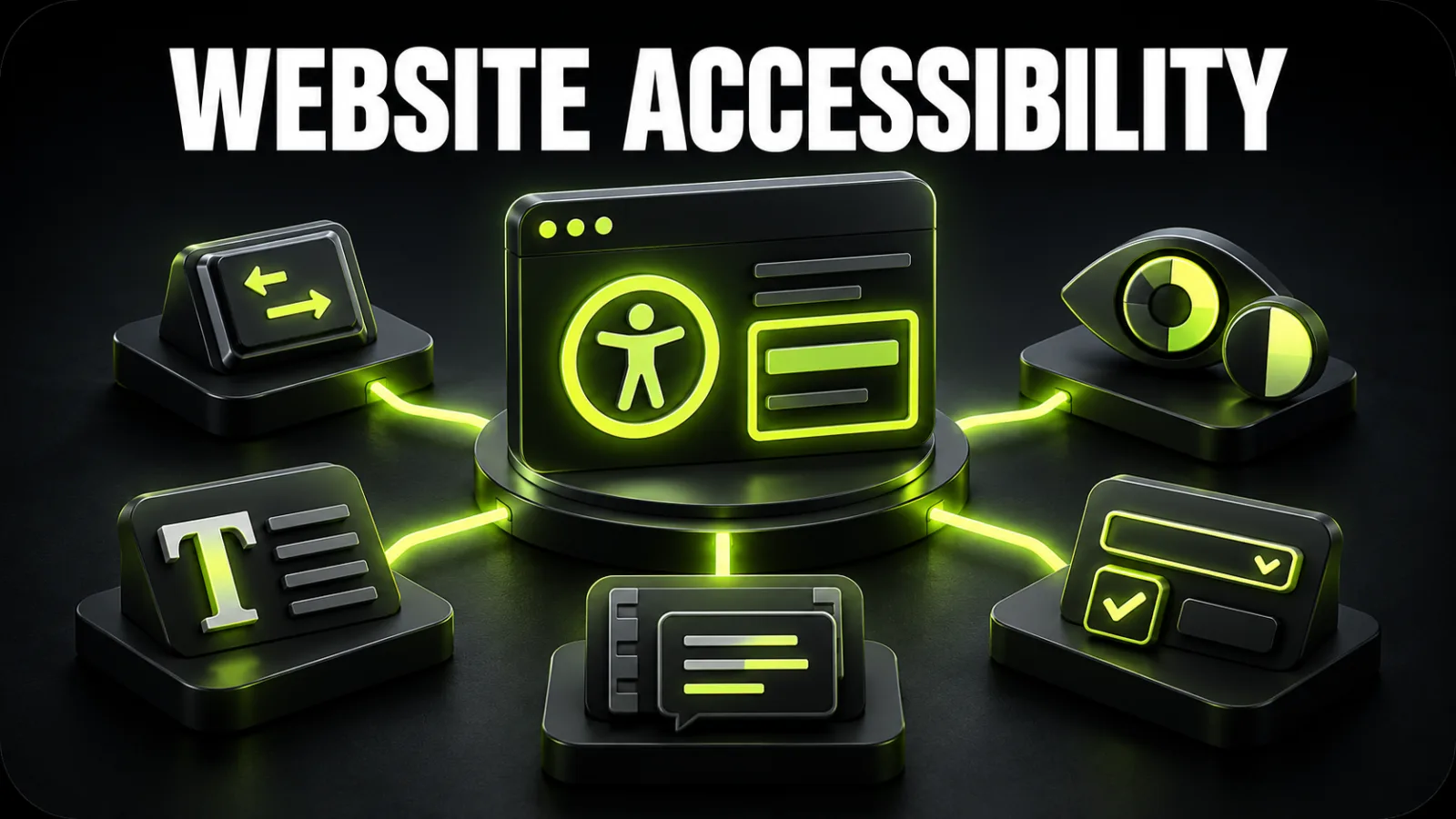
An accessible website lets people with different visual, hearing, motor and cognitive needs understand content and complete important tasks. It is not a separate “disabled version” and not a toolbar that repairs the interface instantly. Accessibility is built into information architecture, design, content, components and code.
For a business, this means fewer barriers to enquiries and purchases, a clearer interface for a wider audience, and less expensive remediation later. When requirements are included in UI/UX design or redesign, contrast, focus, forms and component behavior can be solved systematically before launch.
This article is not a certificate of conformance or legal advice for a particular jurisdiction. It is a practical baseline for preparing a product for deeper evaluation and prioritizing common barriers.
The Web Content Accessibility Guidelines are developed through the W3C Web Accessibility Initiative. WCAG 2.2 organizes testable success criteria under four principles:
Success criteria have A, AA and AAA levels. A and AA are a frequent practical planning baseline, but the required target must be defined through the contract, intended audience, product risk and current rules in each jurisdiction.
Conformance cannot be established from one Lighthouse score. W3C guidance is clear that no automated tool can evaluate every accessibility aspect. Manual journeys, keyboard use, zoom, content review and assistive technology testing remain necessary.
Barriers affect more than people with permanent disabilities. Someone may have an injured hand, temporary hearing loss, tired eyes, an older phone, a noisy environment, bright sunlight, a weak connection or no ability to play audio.
Many accessibility improvements benefit everyone:
Create an inventory of templates and critical journeys before changing random colors. Include:
Then identify the journeys that matter commercially: finding a service, comparing options, submitting an enquiry, paying, downloading a document or contacting support. Those journeys should be completed without a mouse, at increased zoom and with status messages verified.
For a large product, start with a structured website UX audit and add accessibility as a dedicated dimension. This prevents teams from patching one button when the same failure exists across the component library.
Headings should describe the document outline, not merely create large text. Each page needs a clear main heading and logical subsections. Do not select H3 simply because its default size looks right; visual styling belongs in CSS.
Check whether:
<title> describes the page;header, nav, main, aside and footer regions are meaningful;Disable CSS or inspect the accessibility tree. If the content becomes confusing, the visual grid is concealing a structural problem.
Alt text conveys the purpose or information of a meaningful image. It should not copy a filename or begin mechanically with “image of.” Its wording depends on context.
Examples:
Beige linen armchair with wooden legs;alt="" so it is skipped.Avoid repeating the same information in alt text, a caption and adjacent copy. Complex charts need a meaningful text equivalent, not only “sales chart.”
At WCAG 2.2 Level AA, normal text generally requires a contrast ratio of at least 4.5:1 and large text 3:1. Important control boundaries, icons and other graphical objects must also remain distinguishable under the applicable criterion.
Do not judge contrast by eye. Measure actual combinations in normal, hover, focus, disabled and error states. Text over photography must remain readable over the weakest area or use a stable overlay.
Color cannot be the only cue. A red border without “Enter a phone number” does not explain the error. Red and green statuses should also have labels, icons, shapes or patterns.
A light brand accent can still be used, but white text may need to become dark. Accessibility does not remove brand identity; it defines combinations that remain usable.
Put the mouse aside and use Tab, Shift+Tab, Enter, Space, arrow keys and Escape. Every interactive control should receive focus, follow a logical order and avoid trapping the user.
Test:
When a dialog opens, focus should move inside it, stay within the dialog where appropriate, close with Escape and return to the triggering control. Returning the user to the start of the page breaks orientation.
Using outline: none without a strong replacement makes keyboard navigation almost invisible. Focus must differ from default and hover states, survive overflow clipping, and remain visible beneath sticky headers, cookie banners and floating controls.
Define focus states for every component in the design system instead of delegating them vaguely to development. After dynamic updates, verify that focus moves to a meaningful message or next step rather than disappearing.
“Click here” loses meaning outside its paragraph. Prefer “Download the price list as PDF,” “View case studies,” or “Read the delivery terms.” Screen reader users may browse links separately from surrounding text.
A button performs an action; a link navigates. Avoid styling a <div> as a button when a native <button> provides established semantics and keyboard behavior.
An icon-only control needs an accessible name. A decorative icon inside a button that already has clear visible text should not be announced a second time.
WCAG 2.2 includes a minimum target size criterion of 24 by 24 CSS pixels, with exceptions including sufficient spacing. Important mobile controls can and often should be larger, especially in navigation, checkout and forms.
Assess the interactive area, not only the visible icon. Padding can enlarge the target. Inspect close buttons, pagination, product variants, carousel arrows and quantity controls.
The guide to responsive design and mobile UX covers breakpoints, on-screen keyboards, orientation and real touch journeys in more detail.
Do not disable pinch-to-zoom in the viewport. Test at 200% browser zoom and a narrow viewport. Essential content and functions must not disappear, overlap or require two-dimensional scrolling except where a genuine exception such as a wide data table applies.
Increase line height and letter, word and paragraph spacing. Buttons, tabs and cards should survive longer content. Avoid fixed heights where copy can grow.
A placeholder is not a label. It disappears during entry, often has weak contrast and may not provide enough context. Every field needs a programmatically associated name, relevant instructions and an understandable error.
Check:
Do not make users guess a format. Show an example and accept familiar input when practical. Third-party form plugins must be checked in rendered HTML, not only in the visual editor.
Prerecorded video with audio needs synchronized captions under the applicable criteria. Visual information that is essential to understanding may need audio description or a text alternative. Audio-only content benefits from a transcript.
Machine captions require review because names, numbers and specialist language are frequently misrecognized. The player must work by keyboard, expose meaningful control names and avoid unexpected audio.
Avoid content that flashes beyond the safe threshold. Motion-heavy interfaces should respect prefers-reduced-motion, particularly parallax, large transitions and auto-advancing carousels.
Accessibility is also editorial. Long sentences, unexplained abbreviations, vague calls to action and bureaucratic language create cognitive load.
Useful practices include:
Clear language also supports search engine optimization because the page answers intent directly and uses a structure that people and search systems can navigate.
ARIA can describe advanced components, but it does not repair a poor foundation. Prefer native HTML first. A <button> is usually more reliable than <div role="button">, which requires teams to recreate keyboard input, focus and states.
Validate:
expanded, selected, checked and invalid states;Incorrect or redundant ARIA can make an interface less usable. Inspect the accessibility tree and test with a screen reader.
Filters, carts, single-page applications and dialogs update the interface without a full page load. A sighted user sees the result, while assistive technology may receive no notification.
After each action, determine whether:
During website development, these states should be included in component requirements and acceptance criteria rather than discovered accidentally before release.
An accessible site may still lead to an inaccessible PDF, payment service, map, chat or booking widget. Include external services in the end-to-end journey even when your team cannot edit their source code.
For documents, assess headings, reading order, tags, language, image alternatives and table structure. If an important PDF cannot be remediated quickly, provide the information in accessible HTML.
Ask vendors about keyboard support, screen reader testing, accessibility documentation and known limitations. “WCAG compliant” without a version, level and tested scope is not enough evidence.
Automated scanning is useful for missing alternatives, invalid roles, some contrast failures, empty controls, duplicate IDs and basic structural issues. It cannot decide whether an alt description is useful, focus order is logical, instructions are clear or a dialog is genuinely usable.
A practical cycle is:
Response codes, redirects and general diagnostics can also be checked with BB STUDIO tools, but these do not replace specialized accessibility evaluation.
Avoid a flat backlog of one hundred equally urgent findings. Score each issue by impact, frequency, reach and effort.
| Priority | Examples |
|---|---|
| Critical | checkout cannot be completed by keyboard, fields have no names, focus becomes trapped |
| High | body text has weak contrast, focus is invisible, navigation is inaccessible |
| Medium | weak alt description, inconsistent headings, inaccessible isolated tooltip |
| Low | cosmetic improvement without journey impact |
Repair repeated components first: navigation, fields, buttons, dialogs and cards. A design-system fix can remove dozens of instances. Then address templates and page-specific content.
After launch, include regression checks in website support. A new banner, plugin or editorial page can reintroduce barriers that were previously removed.
Targeted fixes are appropriate when the structure is logical, components are consistent, and most issues concern colors, accessible names, focus and markup. Redesign becomes more efficient when pages have chaotic hierarchy, important journeys rely on hover or drag-and-drop, no component system exists, and each template behaves differently.
Review the BB STUDIO portfolio to see the studio's approach to structure and responsive journeys. For a product-specific remediation plan, send the website for an initial review with its priority pages and tasks.
Accessibility is a quality of the entire product, not a standalone overlay. It begins with logical content, continues through the design system and implementation, is confirmed through manual testing, and must survive every release.
The most practical business strategy is to remove blockers in navigation, enquiry and purchase first, repair shared components second, and then make accessibility part of ordinary design, development and content work.
 Artificial Intelligence
 Web development
 Web Application Development
 Analytics and Conversion
 Let’s create something amazing together
